 I build software. The best place to find me is on
 Good Game GUI Design
All games have user interfaces, from first person shooters to puzzle games and hardcore simulations. Their quality ranges from excellent down to looking like they’ve been hastily put together by programmers themselves at the end of a project. Sometimes they seem to only be there to let players have access to the internal workings of the game, almost as an after thought. In this article I’ll discuss why World of Warcraft’s GUI works so well and why games as old as Sim Ant (1991) started the trend in excellent design.
Below is the list of 7 rules I follow during the design of a GUI for any game.
1. Less is more
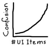 People in general become overwhelmed and confused easily. This is particularly true when playing games as people use them as a time to relax and enjoy themselves. Work out what the player’s options are in each section of the game and remove any UI elements that aren’t relevant or that are used infrequently. From speaking with gamers from casual to hardcore I’ve found that confusion actually grows exponentially with the number of UI elements you have on screen at once.
2. Context sensitivity is in
Context sensitive help and options are all over Windows XP for a reason, it makes life so much easier. If you are right clicking on a folder then you’ll want to perform different operations to right clicking on the start button. In games, there are a multitude of different approaches you can take from performing a different action based on what they clicked on to bringing up different options in a radial menu when they right click on a different object.
3. Match data to representation
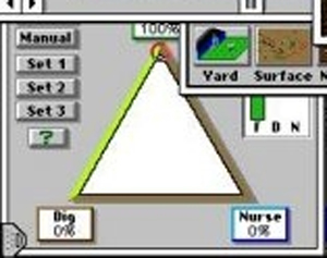 Programmers like to represent everything with numbers on screen. It’s quick, gets the data across and doesn’t take up much room, what more could you want? The use of numbers to represent some data is fine, such as the number of arrows left in your quiver, but displaying the current health of the player can be done in better ways. The first time I saw this work really well was playing Sim Ant over 10 years ago. The player had to assign a resource between 3 different options. Rather than have 3 numbers you could change where increasing one decreased the other two they had a triangle where you dragged a dot to any point in the triangle representing a split of the resources. It was so simple and elegant and even though I was only 10 years old I instantly understood what to do.
4. Mouse over help is in
This is another concept introduced by Windows that works well in games. The Movies does this really well by displaying a help bubble with general information about the object and after a few more seconds displaying more detailed information. World of Warcraft has one of the best mouse over help interfaces I’ve seen in a game to date. Nearly every UI element in the game has information telling you exactly what it does removing the need for a manual or even looking through a help file.
5. Give immediate feedback for every action
This is a key point to reducing the frustration of the player. Whenever they click on a button or object you should let them know that the game has registered their action, from simply playing a sound to playing an animation on the button. Warcraft (the RTS) used to give an immediate response from the character when you ordered them to do something even though the character didn’t actually perform the action until the server sent the response back. You couldn’t notice any problem as your brain was satisfied that the character understood the order and was just a little slow to get moving. If you’ve ever found yourself clicking multiple times or yelling at the screen because you’ve clicked 20 times and nothing has happened you will understand how frustrating this can be.
6. Keep the user from moving all over the screen with the mouse
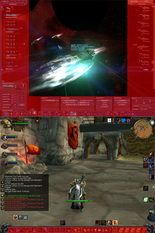 You should try to position UI elements together in their logical groups as much as possible. It’s a good idea to keep UI elements to the sides of the screen out of the way, but try and keep them all in the one area rather than around more than 1 or 2 sides of the screen. In this picture the red parts indicate how much of the screen the user can click on. World of Warcraft succeeds by keeping everything to the bottom while Nexus has 3 sides of the screen where you may need to click meaning you spend a lot of time moving all over the screen to select different options.
7. Design before you begin
Ad hoc GUI’s show and they are really awful to use. This point was reinforced with how difficult the initial UI in CIC was for most users. They were overwhelmed with choice and had options they hardly used. Most parts of your game will only be seen infrequently, however you can be guaranteed the GUI will be on their screen the entire time so it’s important to design it properly. This is reinforced by the fact that releasing your game with a simple ad hoc GUI and then fixing it in a later release means the users will have to re-learn an entirely new interface and they will have picked up bad habits from your first ad hoc design.
I’m working on a small game for a friend for the next month or so after which I will be continuing work on my board game which will be part of the “Electronic Warfare” section of CIC.
[Edit] For my blog on why trying to remove GUI’s completely is a bad idea, go here.